Tuesday, 16 March 2010

Double Page Spread Layout Ideas


This design follows typical conventions of a magazine double page spread layout. It's typical because it is divided into the two pages, both being given their own specific use. The right hand page has the title at the top, and then three columns of information as well as a pull out quote. Where as the left hand page is purely for images. This design is commonly used for double page spreads, which is why I have decided to not use this design for my double page spread. I decided on this due to the fact I want my magazine to stand out from the crowd and not follow what the other magazines do.


This design is very original, yet it does show some similarities to other double page spreads I have seen in the past. The pages have been flipped over, when in relation to the design above. The article and title will be on the left hand page, where as the image will be on the right hand page, leaving me with a good opportunity to place a big eye catching image there to draw in the reader's attention. This will work quite nicely because when people open a book, magazine or comic, their eyes are usually automatically drawn to the left hand page. I have decided that I am going to use this design for my double page spread because it is original, funky and I believe it will appeal to my audience. Also, I can use the large amount of space available on the left hand side to use a big picture.


This design is another conventional layout that is often used for a double page spread. This is because some magazines like to write bigger articles, which is why the columns carry on underneath the main image. In this design, different features are not confined to one side or the other. Instead the text and photos merge across the centre fold, so there are a bit of both on each page. However, the downside to this design is that it can look a bit messy if not used in the correct way. Therefore I am not going to be using this design for my double page spread. Due to the fact I don't want to end up with a spread that looks messy or cluttered. Also, this design incorporates two photos, when in fact I only want to use one big photo on my double page spread.

Contents Page Layout Ideas


This design follows typical conventions of a magazine contents page layout, but also shows a few differences. It's typical to have the title at the top of the page, and then two columns of information. In this case, one being for text and the other for photos. However, the website isn't usually at the top of the page, as it's more commonly featured at the bottom of the page. Overall, I have decided that I will use this design for my contents page. This is because I like the way the text and photos are divided between two columns, making it easier for the audience to read. However, I will make some changes in the process like placing the website at the bottom of the page and moving the title into the top left hand corner of the page.


This design shows a lot more original themes for a contents page layout, as the features on the page are broken down in to smaller areas and are more spread out. For example, there are four small photos in the space of a large photo. The text is also divided into two main boxes, with one located at the top left of the page and one located at the bottom right. This design does follow typical conventions like the website being placed at the bottom of the page and title placed at the top. I have decided that I will not be using this design for my contents page layout because I believe it will be too complicated for the audience to glance over. As contents pages are often read quickly to pick out key information.


This design, like the one I anaylised above, shows originality and the typical conventions of a magazine contents page layout. The title is in the top left hand corner of the page, with the website address located at the bottom of the page. The layout its very similar to the first design, of which I chose to use for my contents page layout, except for this time the image and text columns have been swapped around. I think it looks good, but the images are more eye-catching on the right hand side of the page. Therefore, I have decided I wont be using this design for my contents page layout. However, I will be combining some of the features shown on this design, in the one that I am using for the final layout.

Front Cover Layout Ideas


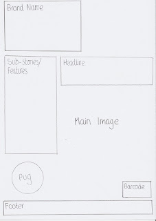
This design follows typical conventions of a magazine front cover layout, with the brand logo being in top left hand corner, the headline underneath, then the sub-stories follow on below. However this design doesn't leave much space for the main image on the front cover, as it is squashed into the space on the left hand side of the page. This makes the page look crowded and messy, therefore I wont be using this design for my front cover.


This design shows more originality for a front cover layout, as it doesn't follow the typical cover conventions. The brand logo remains in the same place, but the other features are located in different places. The headline is at the bottom of the page and the the sub-stories follow are below the brand logo. This leaves much more space for the main image on the front cover, as it isn't confined to a small area. I have come to the conclusion that I will be using this design for my front cover, but the features will be slightly adjusted and moved around in production.


This design again, like the first design, follows typical conventions of a magazine front cover layout. The brand logo is again in the top left hand corner of the page, with the sub-stories underneath. The headline is then situated next to the sub-stories. However, like the first design, this layout confines the image to a small area on the page, this makes the page look cluttered and harder to read, therefore I have decided I wont be using this design for my front cover.

Chosen Ideas For Double Page Spread

I have decided that I will use, "Haich Bee, Exclusive Interview" as my double page spread headline, because it is the one I used on the front cover of my magazine. This makes it much easier for the audience to find, as the page will have the same text on. This saves any frustration or confusion caused in the finding of the double page spread in the magazine. Also, it's needed as it names exactly what is written on the page, so the reader will know what the page is about at a slight glance.

I have decided that I will use, "I want to be the very best I can be..." as the quote I use on my double page spread. This is because it shows how the artist wants to be brilliant in their career, which gets the reader more engrossed in the spread due to the positive words being used. Also, because the quote is much larger and a different colour to the rest of the font on the spread, it will stand out and draw the reader's attention into the text.

I have decided that I will use the colours, Red / Black / White as my double page spread colour scheme. This is because I used these three colours on my front cover and contents page, therefore I want to continue with the same flow throughout the magazine. This makes the magazine look more appealing, which in return makes reading it much easier for the audience.

I have decided that I will use one main image on my double page spread, it will consist of a close up of the artist's face. With the focus being directed on the facial expressions and emotions. This will keep the audience engaged in the spread because with close up images you are able to establish eye contact with the image, which draws you into the page. This image will then be placed on the right hand side of the page because this is where your eyes usually automatically look when you turn a page.

I have decided that on my double page spread, I will use a selection of fonts that are easy to read and that follow the theme of my magazine. Therefore I have chosen, WILL&GRACE, TIMES and 28 DAYS LATER. I chosen WILL&GRACE and 28 DAYS LATER because I have previously used them on my front cover and contents page. This helps keep the fluidity, making sure the same theme is carried on throughout the magazine. I will only use WILL&GRACE designs on the page, for example headers or footers. 28 DAYS LATER will be used for the headline and smaller pieces of writing that need to be able to stand out from all of the other text on the page. Finally, I am going to use TIMES for the actual article, because it is most commonly used for large paragraphs of text. Lots of other magazines and newspapers use TIMES, so the audience will be used to it increasing the chance of them reading on throughout the magazine.

Chosen Ideas For Contents Page

I have decided that I will use, "In This Issue:" as my contents page title, because it doesn't follow the typical conventions of a magazine by simply saying "contents". This shows the audience that my magazine will be different and unique. If it simply followed every other magazine that said "contents", it would make it appear boring. So by using this decision I hope to make my magazine more appealing to the audience.

I have decided that I will use the colours, Red / Black / White as my contents page colour scheme. This is because I used these three colours on my front cover and I want to continue with the same flow throughout the magazine. This gives the magazine a flow, which makes reading it much easier for the audience.

I have decided that I will use multiple images on my magazine contents page. These images will consist of various focal shots, some with a whole body pose and others with close up facial shots which give the audience a wide variety of images that will keep the engaged in the page. However, the large amount of images isn't just for display. Many people will not read much on a contents page if there is a lot of text. So if you place an image next to a passage of text and they both link together as a story, the audience are more likely to read it, as they have a visual reference to go with the feature.

I have decided that on my contents page, I will use all of the fonts which I placed on my front cover. These being IMPACT LABEL, WILL&GRACE, GEORGIA and ARIAL NARROW. This is because I want to keep fluidity to my magazine, making sure I carry the same themes on throughout my magazine. Seen as these fonts all represent the punk genre of music. I will mainly use WILL&GRACE for sub-headings and IMPACT LABEL for the title and smaller pieces of text that need to stand out on my contents page. I am going to use GEORGIA and ARIAL NARROW for the majority of writing on the page because it is easy to read and gives the page a sophisticated look, as well as appealing to the target audience.

Chosen Ideas For Front Cover

I have decided that I will use, "FTR (For The Record)" as my magazine brand name because it is short, snappy and easy to remember. This increases the chances of it sticking in the audiences minds when they are walking around a shop. Secondly, "FTR" is already an acronym standing for "For The Record", which is NOT currently being used for a music magazine. Therefore the audience will understand what the abbreviation stands for. Just like "NME", New Musical Express. Finally, a definition for 'for the record' is; "To make something publicly known, addressing the reader". This fits the ideal conventions of a magazine because it will be letting the audience know about new artists in the musical world.

I have decided that I will use the colours, Red / Black / White as my magazine's colour scheme. This is because it returned the most votes in my questionnaire, proving to be the most appealing to the audience. Therefore this will help my magazine reach out to a wider audience as all of the colours work well together. Finally, there is a big contrast between red, black and white making it stand and jump out to the reader. However you are still able to easily read red font on a black or white background, making it a very suitable colour scheme for my magazine.

I have decided that I will use a medium close up shot for my main image on the front cover. This is because in a medium close up shot, you can still easily see the person's expressions portrayed on their face. As well as a being able to see a pose, by the use of including their shoulders and neck in the shot. Finally, in a medium close up the person's eyes in the image are still looking straight out of the page into the eyes of the reader, engaging them in the magazine due to the eye contact thats easily established.

I have decided that I will use the two fonts; IMPACT LABEL and 28 DAYS LATER as my magazine brand logo. This is because they both compliment each other and comply to a punk rock theme. The 28 DAYS LATER looks like it has been stamped on the page, where as the IMPACT LABEL font is frequently used in the punk genre of music. Where as I will use WILL&GRACE for the text on my front page. This is because it switches from normal to italic styles when typing, to be precise the consonants are in capital letters and the vowels are in lower case italic. This gives a funky. punk feel to the font, which draws the attention of the reader in.

I have decided that I will use, "Haich Bee, Exclusive Interview" as my headline on the front cover of my magazine. This is for multiple reasons; The first being that the headline explains exactly what the main feature of the magazine is going to be. Secondly, it's eye catching and draws the audience in by the use of "exclusive", letting them know that you can only read this story in this magazine. Finally, the headline is short and very informative making it easy to read and understand from a distance. This in return makes the magazine appear much more appealing.

Sunday, 14 March 2010

Questionnaire Results

I managed to get roughly fifty people to answer my questionnaire about magazine related questions. The data was collect via a poll which I created on my blog, this went down the right hand side of the page in the form of a column.

The questions:

1) "What gender are you?" 53 members of the public answered this question.

- Male 34 votes 64 %

- Female 19 votes 35 %

This result showed me that music magazines are predominantly read by men, but still a large amount are women. Therefore I decided that I should include an image on the front cover that will appeal to men, but also take into account something that will interest women. This helped me come to a conclusion on deciding that I should have an image of a good looking woman on the front cover. This will attract men because of the attractive looks, as well as attracting women because they enjoy looking at features, make-up and hair styles. With this decision I am presenting my magazine out to both genders effectively.

2) "How old are you?" 53 members of the public answered this question.

- 11 - 15 10 votes 18 %

- 16 - 20 40 votes 75 %

- 21 - 25 1 vote 1 %

- 26 - 30 0 votes 0 %

- 31+ 2 votes 3 %

This result showed me that music magazines are predominately read by teenagers to people in their twenties. The biggest category being 16 - 20 year olds, receiving 40 votes, with 11 - 15 year olds coming in second with 10 votes. This will be the age range I will be aiming at for my magazine. Therefore I have to design it in a way that will attract this audience to my brand, as well as standing out from other established ones. This includes bright and noticeable colour schemes, attractive models and a catchy, yet memorable brand name. If all of this is done correctly, my magazine should greatly appeal to the audience I am aiming at.

3) "How often do you read magazines?" 51 members of the public answered this question.

- Daily 3 votes 5 %

- Weekly 15 votes 29 %

- Monthly 25 votes 49 %

- Yearly 8 votes 15 %

This result showed me that the majority of the public read magazines monthly, probably due to their price and finding enough spare time. Therefore for my magazine I decided to do an issue for every month of the year. This means that there is more preparation time to construct the designs and layouts for the magazine.

4) "How much money are you willing to spend on a magazine?" 51 members of the public answered this question.

- £0 - £0.99 3 votes 5 %

- £1 - £1.99 13 votes 25 %

- £2 - £2.99 18 votes 35 %

- £3 - £3.99 13 votes 25 %

- £4 + 4 votes 7 %

This result showed me that the majority of the public prefer a magazine that has a mid price range, around the £2.50/£3 mark. If the magazine is priced to cheaply, the company will make a loss due to the costs outweighing the income from the actual product. If the magazine is priced too expensively the audience will not want to buy it. As high priced items turn audiences away if they are unwilling to spend a large sum of their money on a magazine. Therefore I have come to the conclusion that I will price my magazine at £2.99, because it is within the range of which the audience decided would be their total amount that they would spend on a magazine. This also has a psychological factor involved, when the reader sees "£2.99", they assume the magazine is cheaper because it has a lower digit at the start. Whereas if they saw, "£3.00" it would slightly turn them off because there is a higher digit at the start of the price. This can determine whether people buy a magazine or not, even though there is only a 1p difference between the two.

5) "Which brand name do you prefer?" 49 members of the public answered this question.

- Riff 8 votes 16 %

- Journey 8 votes 16 %

- Alternative 5 votes 10 %

- The Record 6 votes 12 %

- FTR (For The Record) 22 votes 44 %

This result showed me that the public who voted in my questionnaire thought "FTR" was the best brand name for my magazine. This may have been because it is a small name to remember, so it stays in the mind for longer, like "NME" or "Q" magazines. Which are all memorable magazine names. Secondly it appeals to the younger audiences because it sounds like the abbreviation 'ftw', which stands for 'For The Win' meaning something's good or great. Therefore I came to the conclusion that I will use this name for my magazine, as it will appeal to a much wider audience.

6) "Which colour scheme do you prefer?" 51 members of the public answered this question.

- Red / Black / White 27 votes 52 %

- Greyscale 4 votes 7 %

- Sepia 4 votes 7 %

- Blue / Black / White 8 votes 15 %

- Green / Black / White 8 votes 15 %

This result showed me that the majority of the audience liked red, black and white as a magazine colour scheme, rather than any of the other possible selections. This led me to believe I should incorporate or use these colours on my magazine front cover, and carry it on as the magazine's theme. By choosing the colours that people like the most will increase the likelihood of them actually purchasing the magazine when the see it in the shops. Also, red, black and white all contrast with each other making the magazine stand out from others when on the shelt. As well as being easy on the eye to look at.

7) "What sort of image do you prefer on the front cover?" 50 members of the public answered this question.

- One main band/artist 36 votes 72 %

- Multiple bands/artists 6 votes 12%

- Big collage of bands/artists 8 votes 16 %

This result showed me that having one main focal image of a band or artist on the front cover greatly appealed to the audience, instead of having lots of images of bands or artists. This is probably because with one image you can focus directly on that artist and know that they are one of the big features in the magazine, as well as being able to see it easier from a distance. Where as when you have smaller images of lots of artists it tends to be harder to focus in on one specific image. Many images can also make the page look cluttered if they aren't in the correct layout. Therefore, because of this result, I am going to use one large image of a band or artist on my front cover.

8) "What is your favourite music genre?" 51 members of the public answered this question.

- Pop 7 votes 13 %

- Electronica & Dance 4 votes 7 %

- R&B 8 votes 15 %

- Rock 13 votes 25 %

- Heavy Metal 4 votes 7 %

- Indie 7 votes 13 %

- Alternative & Punk 6 votes 11 %

- Classical 2 votes 3 %

This result showed me that people's music tastes are very varied and often conform with different genres of music. My original magazine genre was Punk Rock, which proved popular in the questionnaire. With Rock receiving 13 votes and Punk receiving 6 votes, the combined scores show that it will be a popular genre. However, although my magazine has a punk rock feel to it, it will merge into similar genres once inside the covers. This is because it will appeal to a much wider audience, like "NME" magazine does.

Initial Ideas For Double Page Spread

Headline;
- Truth or Dare?
- Is it true?
- Haich Bee, Exclusive Interview
- See no evil?
- Beautiful Nightmare

Quote;
- "I'm having the time of my life..."
- "I want to be the very best I can be..."
- "Music has inspired me and I hope my music can inspire you"
- "No matter how many songs have been written, there is always room for more!"
- "I'm absolutely ecstatic!"

Colour Scheme;
- Red / Black / White
- Grey scale (Dark / Medium / Light)
- Sepia (Dark / Medium / Light)
- Blue / Black / White
- Green / Black / White

Images;
- Multiple Images: There will be more than one image on the page, ranging from small to large, placed in specific points on the double page spread. This shows the reader a wider selection of interesting photos to do with the band/artist.
- One Main Image: The photo will be a close up shot of the band/artist and act as one of the main focal points on the page, showing much more emotion and facial expressions.
- One Main Image: This main image will be a long shot of the band or artist, showing a pose and a expressing body language. This will, like above, be a main focal point on the double page spread.

Fonts;

Initial Ideas For Contents Page

Title;
- Contents
- CoNtEnTs
- c.o.n.t.e.n.t.s
- Featured This Week...
- In This Issue:

Colour Scheme;
- Red / Black / White
- Grey scale (Dark / Medium / Light)
- Sepia (Dark / Medium / Light)
- Blue / Black / White
- Green / Black / White

Images;
- One Main Image: Pulling a pose, whole body long shot, eg.. Leaning against a wall.
- Multiple Images: Various focal shots, some with whole body pose, others with close up facial shots.
- Multiple Images: The various images are all long shots of the artist posing, either with their body language, or with an instrument.

Fonts;