

This design follows typical conventions of a magazine front cover layout, with the brand logo being in top left hand corner, the headline underneath, then the sub-stories follow on below. However this design doesn't leave much space for the main image on the front cover, as it is squashed into the space on the left hand side of the page. This makes the page look crowded and messy, therefore I wont be using this design for my front cover.

This design shows more originality for a front cover layout, as it doesn't follow the typical cover conventions. The brand logo remains in the same place, but the other features are located in different places. The headline is at the bottom of the page and the the sub-stories follow are below the brand logo. This leaves much more space for the main image on the front cover, as it isn't confined to a small area. I have come to the conclusion that I will be using this design for my front cover, but the features will be slightly adjusted and moved around in production.
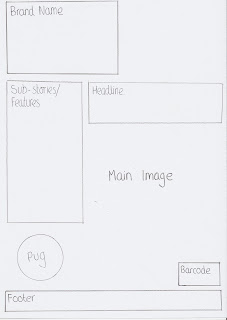
This design again, like the first design, follows typical conventions of a magazine front cover layout. The brand logo is again in the top left hand corner of the page, with the sub-stories underneath. The headline is then situated next to the sub-stories. However, like the first design, this layout confines the image to a small area on the page, this makes the page look cluttered and harder to read, therefore I have decided I wont be using this design for my front cover.

No comments:
Post a Comment
Note: only a member of this blog may post a comment.