

Number 1) This photo leaves alot of room on both the left hand side and at the top of the page, which is ideal for the magazine. This is because the masthead and the features are always usually located and listed on this side of the magazine. This is due to the fact that when magazines are laid out on a shelf, they often have the information easily labled there so people can recognise what brand it is and what the issue's features are. However I will not be using this photo because the model is looking down at the ground. Where as I want her to be looking out of the page so that the reader can establish eye contact and be drawn into the magazine. Also, if this was on the front cover of a magazine it would be hard to work out who the person was from a distance.
Number 2) This photo leaves alot of room at the top of the page, but a bit less on the left hand side than the photo above. This is because the image was taken closer to the model this time in order to get more emotions and facial expressions, which has been successfully achieved. Also, the model is looking forwards out of the page, which creates the eye contact I was looking for. Unlike the photo above, you will be easily able to recognise the artist on the front of the magazine with this image because it is closer in and you can see the whole of the person's face. Another main thing I like about this photo is that the model's arms and shoulders are in the shot as well. This gives a much better pose, which makes the image more lively and appealing to look at. I have decided that I am going to be using this image on the front cover of my magazine because it contains all of the features I am looking for in a photo and I believe it will appeal to the target audience.

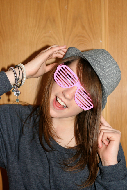
Number 3) In this image, the only space available to work with it at the top and bottom of the photo due to the fact that this is zoomed in closer than the one above. This causes a few problems because it results in headlines, features and pugs potentially having to be placed over the image. Which will obscure it and make it harder for the audience to recognise from a distance away. As well as making it seem cluttered and tidy, which is not a good impression to leave with the reader as a soon as they pick up and see the magazine. Apart from that, you are able to see the whole of the face and resulting expressions. However this photo just doesn't have the right dimensions or appearance for my magazine front cover, therefore I wont be using it for my magazine.

Number 4) I like this image because it has perfect layout for a double page spread, seen as the model's face will take up one side of the page. Leaving a patterned background on the other side, suitable for placing text onto. However the main issue with this image is that the camera has focused on the background, rather than the model herself. This leaves a very sharp in-focus background and a blurry model, which I do not want to use on my double page spread. The models face has to be in focus in order for my spread to look best. Therefore I will not be using this image for the double page spread of my magazine, purely because the focus is wrong.

Number 5) This image is perfect for my double page spread because it solves all of the problems that I was presented with in the photo above. The focus is on the model's face, making her sharp and vivid, where as the background is soft and much easier on the eye to look at. Also, in this photo her eye is looking straight out of the page into the audience's eyes, bringing forward the recurring theme of making eye contact with the image on the page. Therefore I have decided that I will definitely be using this image for my magazine's double page spread.

No comments:
Post a Comment
Note: only a member of this blog may post a comment.